Create Stunning 3D Flip Cards in Elementor Free (No Pro Required!)
Tired of static content on your website? Want to add a touch of interactive magic that wows your visitors? Look no further! The 3D flip card is a fantastic way to present information—like team profiles, services, or pricing tiers—in a fun and engaging way.
One side shows an image or title, and when a user hovers over it, the card elegantly flips around to reveal more details and a call-to-action button.
In this tutorial, I’ll show you exactly how to build these beautiful 3D flip cards using only the free version of Elementor and a little bit of copy-and-paste CSS. We’ll be using Elementor’s containers, so you can design everything visually.
Let’s get started! (Hover over the cards to see the effect)

John Doe
CONTACT INFO
Email : johndoe@johndoeweb.com
instagram: @johndoecontact
Phone: +33 475 26 59
John Doe
CONTACT INFO
Email : johndoe@johndoeweb.com
instagram: @johndoecontact
Phone: +33 475 26 59
John Doe
CONTACT INFO
Email : johndoe@johndoeweb.com
instagram: @johndoecontact
Phone: +33 475 26 59
What You'll Need
- 1. Elementor (Free Version): Make sure it’s installed and activated.
A Bit of Patience: This is super easy, but it involves a few steps.
The CSS Code: Don’t worry, I’ll provide it below!
Step 1: Build the Foundation with Containers
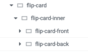
The secret to this effect is a specific nested container structure. The easiest way to manage this is by having the Navigator open. You can open it by right-clicking anywhere and selecting “Navigator”.
1. The Main Wrapper Container (flip-card)
First, add a new Container to your page. This will be the main wrapper for our card.
Select the container and go to the Advanced tab.
In the CSS Classes field, type
flip-card.Now, go to the Layout tab. Give it a Min Height to define the size of your card. Let’s use
400pxfor this example.
2. The Inner Flipper (flip-card-inner)
Next, drag a new Container inside the flip-card container you just made. This container is the part that will actually perform the 3D rotation.
Select this new inner container.
Go to its Advanced tab.
In CSS Classes, type
flip-card-inner.
3. The Front and Back Faces
Now we need to create the two faces of our card. Drag a new Container and place it inside the flip-card-inner container.
Front Face: Select this container, go to its Advanced tab, and give it the CSS Class
flip-card-front.Back Face: To make it easy, right-click the
flip-card-frontcontainer in the Navigator and choose Duplicate. Now, simply select the duplicated container and change its CSS Class toflip-card-back.
When you’re done, your structure in the Navigator should look exactly like this:
Step 2: Design Your Cards (The Fun Part!)
Now you can design the front and back of your card using any Elementor widgets you like.
Design the Front (
flip-card-front): Select theflip-card-frontcontainer. Go to its Style tab to set a background image or a solid color. Then, drag widgets into it—an Image widget for a team member’s photo or a Heading widget for a service title works perfectly.Design the Back (
flip-card-back): Select theflip-card-backcontainer. Set a different background color in its Style tab. Then, drag in your content, like a Heading for the name, a Text Editor for a short bio, and a Button for a “Read More” or “Contact” link.
Note: In the editor, these two containers will just look stacked on top of each other. Don’t worry! Our CSS will position them correctly on the live site.
Step 3: Add the Magic with Custom CSS
This is the code that brings our flip card to life.
Inside Elementor, click on the + sign and add an HTML block
Open the HTML block
Copy the code below and paste it into the content box.
<style>
/* -- 3D Flip Card for Elementor Containers -- */

/* 1. The main wrapper that creates the 3D space */
.flip-card {
  perspective: 1500px;
  min-height: 400px; /* Make sure this matches the height you set in Elementor */
}

/* 2. The inner container that performs the flip */
.flip-card-inner {
  position: relative;
  width: 100%;
  height: 100%;
  transition: transform 0.8s;
  transform-style: preserve-3d;
}

/* 3. The hover trigger */
.flip-card:hover .flip-card-inner {
  transform: rotateY(180deg);
}

/* 4. Front and Back face styling */
.flip-card-front,
.flip-card-back {
  position: absolute;
  width: 100%;
  height: 100%;
  -webkit-backface-visibility: hidden; /* Hides the back of the element */
  backface-visibility: hidden;
  display: flex; /* Helps with vertical alignment of content */
  flex-direction: column;
  justify-content: center;
  align-items: center;
  padding: 20px;
  border-radius: 10px; /* Optional: adds rounded corners */
  overflow: hidden; /* Prevents content from spilling out */
}

/* 5. The back face needs to be rotated initially */
.flip-card-back {
  transform: rotateY(180deg);
  /* You can set a default background color here if needed */
  background-color: #0073e6;
  color: white;
}
</style>
Once you paste the code, click the Publish button.
Voilà! Your 3D Flip Card is Ready!
Go back to your Elementor page and preview it. You should now have a fully functional, beautifully animated 3D flip card.
Bonus: Customization Tips
Want to tweak the effect? It’s easy!
Change Flip Speed: In the CSS, find
.flip-card-innerand change thetransition: transform 0.8s;value. A smaller number (0.5s) is faster, a larger number (1.2s) is slower.Change Flip Direction: To make the card flip vertically from bottom to top, replace every instance of
rotateY(180deg)withrotateX(180deg).Add Rounded Corners: The code already includes a
border-radius: 10px;. You can increase or decrease this value to change how rounded the corners are.
And that’s a wrap! You’ve just added a professional, interactive element to your site that will surely impress your visitors.