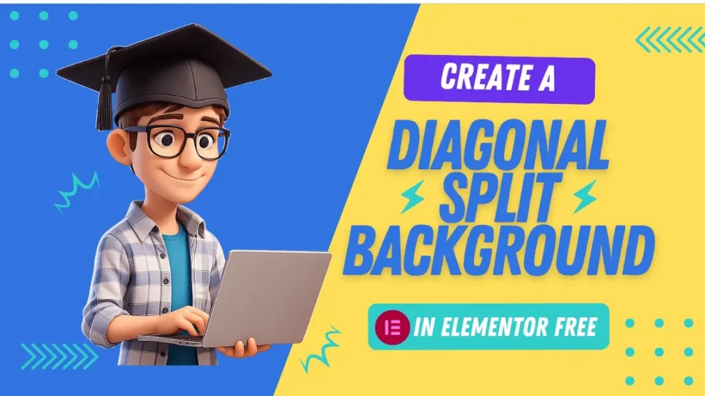
How to Create Stunning Diagonal Split Backgrounds in Elementor Free
Want to add a dynamic and modern touch to your Elementor website without upgrading to Pro? You’re in luck! While Elementor Pro offers a “Custom CSS” panel, you can achieve beautiful diagonal split backgrounds using just the free version and a little bit of custom CSS.
This tutorial will guide you through creating a captivating two-tone diagonal background within a single container. We’ll use CSS to create one background color, then layer a second, diagonally cut color on top.
Here’s the stunning effect we’re aiming for:
Catchy Header Text
Lorem ipsum dolor sit amet, consectetur adipiscing elit. Ut elit tellus, luctus nec ullamcorper mattis, pulvinar dapibus leo. Lorem ipsum dolor sit amet, consectetur adipiscing elit. Ut elit tellus, luctus nec ullamcorper mattis, pulvinar dapibus leo.
Lorem ipsum dolor sit amet, consectetur adipiscing elit. Ut elit tellus, luctus nec ullamcorper mattis, pulvinar dapibus leo. Lorem ipsum dolor sit amet, consectetur adipiscing elit. Ut elit tellus, luctus nec ullamcorper mattis, pulvinar dapibus leo.
Catchy Header Text
Let’s dive in!
Why a Single Container for Split Backgrounds?
Using a single container for a split background offers several advantages:
Simplicity: Fewer elements mean a cleaner page structure.
Responsiveness: It’s often easier to manage responsiveness with one element rather than two separate columns or containers trying to create a split.
Flexibility: Your content can span across the entire container, flowing naturally over the split background.
Step 1: Set Up Your Container in Elementor
First, we need to create the main container that will house our diagonal background and your content.
- Add a New Container: In your Elementor editor, drag and drop a new Container widget onto your page.
- Set Height (Optional but Recommended): Select the container, go to the Layout tab, and under Height, choose Min Height. A common value is 500px or 100vh if you want it to fill the entire viewport height.
- Set the First Background Color: Go to the Style tab of your container.
- Under Background Type, select Classic.
- Choose your first background color. This will be the color for the right/bottom side of your diagonal split. For this tutorial, let’s use a light beige, like #2FCCCA.
- Add a CSS Class: Go to the Advanced tab of your container. In the
CSS Classesfield, type a unique name. Let’s usediagonal-bg-container. Make sure there are no dots or spaces. - Add Your Content: Now, drag any widgets you want (like a Heading, Text Editor, or Button) into this container. Don’t worry if they don’t look perfect yet; we’ll refine that later.
Step 2: Inject the Custom CSS for the Diagonal Split
Since we’re using Elementor Free, we can’t use the “Custom CSS” panel on the container itself. Instead, we’ll use an HTML widget to inject our CSS.
Add an HTML Widget: Drag an HTML widget onto your page. It can be placed anywhere, even in the same container, as its content won’t be visible on the front end, only its CSS effect.
Paste the CSS Code: Copy and paste the following entire code block into the HTML widget’s content area.
<style>
/* 1. Prepare the main container for positioning */
.diagonal-bg-container {
  position: relative; /* Essential for positioning the pseudo-element */
  overflow: hidden;   /* Hides anything that might go outside the container */
}

/* 2. Create the second color layer (the diagonal part) */
.diagonal-bg-container::before {
  content: ''; /* Required for pseudo-elements */
  position: absolute; /* Allows precise positioning */
  top: 0;
  left: 0;
  width: 90%;
  height: 100%;

  /* --- SET YOUR SECOND BACKGROUND COLOR HERE --- */
  background-color: #34495E; /* Example: Dark Teal - Change this! */

  /* 3. The magic: defining the diagonal shape */
  /* (0 0) ----------- (100% 0)  <-- Top edge */
  /* |                    /   */
  /* |                   /    */
  /* |                  /     */
  /* (0 100%) ----- (40% 100%) <-- Bottom edge (diagonal starts here) */
  clip-path: polygon(0 0, 100% 0, 10% 100%, 0 100%);

  /* Ensure this layer stays behind your content */
  z-index: 0;
}

/* 4. Ensure your content stays on top of the background layers */
/* This targets the inner Elementor div that holds your widgets */
.diagonal-bg-container > .elementor-widget-container {
   position: relative;
   z-index: 1;
}

/* 5. Optional: Adjust content alignment for better visibility */
.diagonal-bg-container {
    display: flex; /* Use flexbox for easy content centering */
    align-items: center; /* Vertically center content */
    justify-content: center; /* Horizontally center content */
    text-align: center; /* Center text within widgets */
}
/* 6. Basic Responsiveness: Remove diagonal on smaller screens */
/* This targets tablets and mobile devices */
@media (max-width: 767px) {
  .diagonal-bg-container::before {
    clip-path: none; /* Removes the diagonal clip */
    height: 50%;     /* Makes it a horizontal half-split instead */
  }
  /* Optional: Adjust main container background for mobile */
  .diagonal-bg-container {
    background-color: #34495E; /* Make the whole container the left color */
  }
  /* Optional: Adjust the 'before' layer for a simple top-half on mobile */
  .diagonal-bg-container::before {
    background-color: #F5F0E1; /* Second color becomes top half */
    height: 50%;
    clip-path: none; /* Ensure no clipping */
  }
}
</style>
As soon as you paste the code, you should see your background transform to this diagonal split background look!
How the CSS Works (The Magic Explained)
Let’s break down that CSS to understand what’s happening:
.diagonal-bg-container:position: relative;: This is crucial. It tells the browser that any absolutely positioned children (like our::beforeelement) should be positioned relative to this container.overflow: hidden;: Ensures that if any part of our diagonal layer extends beyond the container’s bounds (whichclip-pathhandles nicely), it won’t cause scrollbars or visual glitches.
.diagonal-bg-container::before: This is a pseudo-element. Think of it as a virtual content layer that exists inside your container but isn’t part of your regular HTML.content: '';: Required for pseudo-elements to render.position: absolute; top: 0; left: 0; width: 100%; height: 100%;: These lines make our::beforeelement perfectly cover the entirediagonal-bg-container.background-color: #34495E;: This sets the color for our new, diagonally-cut layer (the left/top part of your split). Remember to change this color!clip-path: polygon(0 0, 100% 0, 40% 100%, 0 100%);: This is the core of the diagonal split. It defines a four-sided shape by listing coordinates (X Y):0 0: Top-left corner.100% 0: Top-right corner.40% 100%: A point on the bottom edge, 40% from the left.0 100%: The bottom-left corner. The browser connects these points, creating a polygon that starts at the top-left, goes to the top-right, then diagonally down to the 40% mark on the bottom, and then straight across to the bottom-left, completing the shape.
z-index: 0;: This places our::beforebackground layer behind any regular content you add to the container.
.diagonal-bg-container > .elementor-widget-container:position: relative; z-index: 1;: This ensures that the actual content inside your Elementor container (headings, text, buttons) appears above the::beforepseudo-element.
Responsiveness (
@mediaquery):@media (max-width: 767px): This code only applies to screens 767 pixels wide or smaller (typically tablets in portrait mode and mobile phones).clip-path: none;: On smaller screens, the diagonal split is removed to avoid awkward cuts.height: 50%;: We’ve added a fallback to create a simple horizontal split on mobile, making the::beforeelement take up the top 50% of the container. You can adjustbackground-colorhere to match your design goals.
Adjusting the Diagonal Angle
To change where the diagonal line starts and ends, simply adjust the 40% and 100% values in the clip-path property:
clip-path: polygon(0 0, 100% 0, 40% 100%, 0 100%);40% 100%: This controls the bottom-right point of the diagonal.Changing
40%to60%will move the bottom end of the diagonal further to the right, making the diagonal less steep.Changing
100%to80%would move that point up from the bottom, creating a triangle if not combined with the bottom-left point.
Play around with these values to find the perfect angle for your design!
Final Touches & Tips
Padding: Add some padding to your main container (e.g., in the Advanced tab under
Padding) to give your content breathing room away from the edges.Content Alignment: Use Elementor’s layout options for your container (e.g.,
Justify Content: Center,Align Items: Center) to position your text and buttons exactly where you want them.Text Color: Make sure your text color contrasts well with both background colors. You might need to adjust individual widget text colors if you want some text to match one side of the split and other text to match the other.
And there you have it! A professional-looking diagonal split background in Elementor Free, giving your website a unique edge. Experiment with different colors and angles to match your brand’s aesthetic. Happy designing!